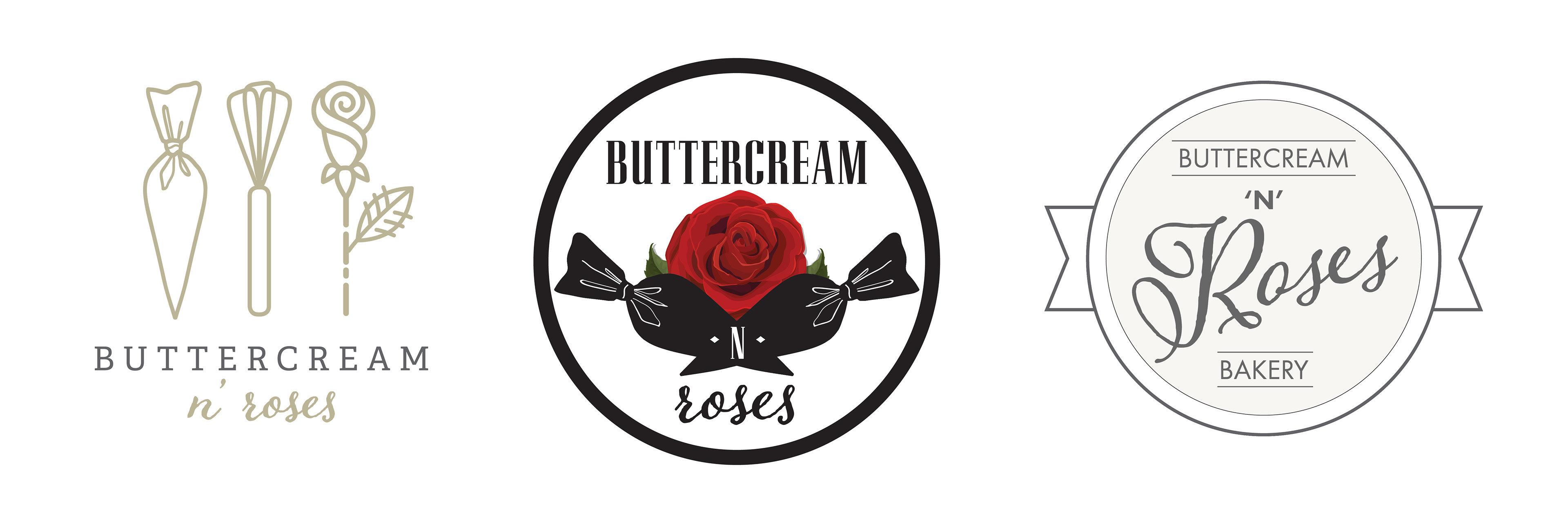
"Buttercream N Roses" Client Logo Study
This was a logo study done for a start-up business. The name of the business was inspired by the popular 80's heavy metal band "Guns N Roses" and for the owners' aesthetic. Logo studies are done by getting ideas from the client and then narrowing down to the concept that best fits their vision. The client mentioned both liking the trendy "modern vintage" aesthetic as well as going for the more dark, "hard rock" look from the business's namesake.